

How Many Colors In A Logo
What color should your new logo be? Choosing the right logo color for your business isn't an easy task. Choosing a logo can feel high-stakes. It's the first impression someone will have of your business.
Choosing the right logo can make all the difference in how people feel about your brand. It takes about 50 milliseconds (0.05 seconds) for people to form an opinion about your brand just from your logo alone. That means you truly have to work your magic to make that logo stand out.
Logos Impact Brands in a Big Way
Logos are everything you want to say about your brand without actually saying it. The logo you choose for your brand should be instantly recognizable by your customers. The most iconic, well-known logos share a couple of traits:
- They're simple.
- They use the best-suited colors.
- They use color in the right way.
While the idea of finding "the right way" to use color can feel daunting, it's actually a pretty approachable task. While there are many best practices in the design world, there is no "one size fits all" model for logos. If there were, we might see varieties of golden arches on everything.
This guide will walk you through everything you need to know about color theory for business. Once you know what different colors mean, you'll be able to better navigate color meaning to tell your brand story as effectively as possible.
How a Logo Color Influences Perception of Your Brand
Color psychology is the study of hues and their influence on human behavior. It's one of the key pillars of branding and marketing and it is a key player when it comes to deciding on your logo's colors.
Logo design is an exercise in imagination, and there's no out-of-the-box solution that will fit every business's needs. One shade of color may work for one brand, while another business in the same industry may find a different color more effectively supports their goals.
The Most Common Logo Colors
Let's have a look at the choice in colors by the world's biggest brands:
- Blue: 33%
- Red 29%
- Black, Grey, Silver: 28%
- Yellow, Gold: 13%
While blue is the most common logo color, that doesn't necessarily mean it's the best. It's a start though. You can take this information and ask yourself: What does the color blue make people feel? Why do brands tend to try to evoke that in their logo? Why might someone want to use red instead? What does the color red indicate?
If you read that thinking, "But I have no idea what the color blue means," no sweat. We're going to cover that below. Right now, you're getting a lay of the land, an important step in your journey to becoming a logo color expert.
How Most Brands Use Color in Their Logos
Most logos are 2 colors. In fact, around 95% of brands only use 2 colors in their logo, and only 5% use three or more.
Examples of Famous Brand Color Combinations:
- Facebook: blue and white
- Ikea: blue and yellow
- Colgate: red and white
- FedEx: purple and orange
- Starbucks: green and white
- McDonald's: yellow and red
- Coca-Cola: red and white
- Foundr: black, red, and white
Plenty of other brands use more than three colors. Google, one of the recognizable brands in the world uses blue, red, yellow, and green in their logo for a rainbow-inspired effect. For most businesses, though, it's better to keep it simple. Try to stick to two or three logo colors maximum to avoid making it feel cluttered.
Each Color Has Its Drawbacks
Every color has its positive and negative connotations. Remember that logo design is art, and art is subjective. Some people may find the color blue incredibly soothing because it reminds them of the ocean, whereas someone with severe thalassophobia may find the color blue terrifying.
The fact of the matter is, you are never going to be able to choose a color that is universally adored. We say this time and time again, it's all subjective. What matters is that your logo resonates with your audience. Given how time-consuming, labor-intensive, and expensive the logo creation process is, it can be tempting to try to speed through it as quickly as possible.
This is a mistake. Once you've made it through the brainstorming process, you'll want to spend the time testing your logo to ensure it resonates with the people who matter most: your target customer.

Your Guide to Logo Color Meanings
To find the right color palette for your brand logo, you need to know what it means. Let's walk through each color so you can understand the color psychology of each hue. This list includes the colors most commonly used in brand logos to help you narrow down which colors evoke which emotions and associations, so you find the perfect logo color combinations to explore during your design process.
White Logos
White is often associated with cleanliness, peace, hygiene, simplicity, and sincerity. The meaning of this color can change radically based on cultural values. For example, in some areas of the world, white is associated with weddings (thanks to a trend created by Queen Victoria), while in others white is associated with burials and mourning. If you choose white for your logo, you'll want to be cognizant of who your target customer base is and how their cultural values might change the way that they perceive the color.
White is also frequently used as a contrasting color, either to create negative space in a logo or to compliment the other surrounding colors. FedEx does a great job of using white in their logo, using the white negative space in between two letters to create a sneaky "arrow". Can you see it?

Silver Logos
Silver is the color of sleekness, wealth, grace, and elegance. When used as a color in a logo, silver acts as a great descriptor of everything high-end, industrial, and technology-related. Some jewelry brands used to have silver in their logos, but over time it has become a little dated as the color became more associated with industrial metals rather than fine metals.
The silver details on your logo may be a great way to emphasize the sophistication and the upmarket side of your brand. No wonder so many car brands use it (Toyota, Mercedes-Benz, Honda, and Citroen to name a few). It's also often used for video gaming brands to suggest weaponry and war.
![]()
Yellow/Gold Logos
Yellow usually evokes feelings of optimism, confidence, self-esteem, happiness, and encouragement. It suggests sunshine, summer, and can even evoke feelings of wealth and money. A certain golden color can also make you think of McDonald's, but that's just proof of how powerful a logo can be.
Nothing says 'expensive' more than gold. It's the color of wealth, victory, wisdom, royalty, prosperity, glamour, luxury, and prestige. The warmth of gold irradiates everything around it. But don't get wires crossed when it comes to yellow and gold (pure yellow has a #FFFF00 color code and gold has #FFD700). The golden hues have some red or brown in them, which gives them power that pure yellow doesn't.
Yellow pops up in many luxury brands for this exact reason. It suggests wealth and prosperity, and that's why it works so well for luxury brands, finance, food, beauty, and fashion-related companies. The most famous gold logos include Cadbury, Chevrolet, and Warner Bros.
As a duality for yellow, it can also suggest a bargain, something on sale, or even cheap products. This works well for brands like BestBuy, where low prices are their selling point but might not translate well if you want to be high-end. It's also associated with caution, like with hazard signs and traffic lights.
![]()
Orange Logos
Orange is a cheerful, friendly, and enthusiastic color. Orange tends to stir up a little controversy when it comes to logo design. As it's often used for high-visibility, it can cross the line between eye-catching and eye-sore quite easily. Peachier tones seem to be more popular than heavy dark-orange or red-orange for this reason.
Orange can be a little harsh on the eye if not balanced with a nice neutral color. It's often used by brands that are looking to promote themselves as fresh, exciting, friendly companies. It's the perfect color for brands that are looking to promote entertainment (think of Nickelodeon, and Soundcloud), food and beverages (Fanta, Dunkin Donuts), and even more energetic brands like Firefox and Timberland.
In many Asian countries, orange is a color that triggers associations with religion (especially Buddhism and Hinduism).

Red Logos
Universally considered to be representative of romance, red can stir up a lot of emotions. It can represent energy, passion, love, power, and seduction. On the flip side, red can also suggest war, conflict, anger, and stress.
Red is another color that has strong connotations in different cultures. For many, it is representative of romance and love. In Asia, it's usually the color of weddings. It symbolizes fortune, happiness, and fertility. In some African countries, on the other hand, red is a color of death and mourning.
Using a bright red logo is a classic marketing trick. It tends to catch the eye of impulsive shoppers by creating urgency, especially around Valentine's day.
Red is often paired with white, black, or other neutral shades for brands that are high-energy and powerful. Lots of restaurants and food brands use red, including the most iconic color-combo by Coca-Cola, and is often used in sports (FC Bayern, FC Liverpool, Arizona Cardinals, Chicago Bulls), food, transport, and retail.
Pink Logos
Pink logos connotate hope and inspiration. This secondary color is associated with calm, reassurance, and comfort. It's often associated with childhood or a dreamy, fantasy side of life.
In Japanese culture, pink is a traditional color of spring (it matches the blossoming sakura), and in branding, it tends to pop up for brands that are "sweet" or female-focussed.
In recent years, we've seen an enormous uptick in the use of pink within logos and company branding, specifically in a shade that has come to be known as "millennial pink." The use of millennial pink in your company branding or marketing instantly suggests that your product is targeted at millennials (usually women), and you offer some Instagram-friendly solutions to their life problems. It could be a millennial pink Always pan, Quip toothbrush, or any number of beauty products from Glossier. But even the companies who rely heavily on pink iconography often don't use pink in their logo. Of the three examples we just mentioned, only one uses pink in their logo (it's Glossier… and only sometimes).
As a logo color, pink doesn't pop up that much but when it does you can see that it's often for baby brands, desserts, and toys. Unfortunately, the dual nature of pink means that it can often suggest immaturity or playfulness that wouldn't resonate well for certain industries. For example, a tax accountant may not thrive with a hot pink logo as opposed to another color.
![]()
Green Logos
Green is the easiest color on human eyes, and it's the color our eyes are most sensitive to, mainly because we can discern the most shades of the green palette. That's why green is an international color of relaxation, nature, and peace. Green is all about harmony, rest, equilibrium. In some ways, it's a color of wealth (it is the color of money, after all).
Green has evolved to be universally associated with the environment and environment-friendly products. Vegetarianism, veganism, and eco-friendly brands use green to signify their values. Next time you are shopping for food, have a look at the health food aisle and see how green the branding is in that aisle.

Blue Logos
Blue is the most popular color for marketers and brands the world over. It's a color of calm, control, logic, honesty, intelligence, security, purity, freedom, and confidence. Its soothing tones help to establish trust-based relations and tend to give the logo a professional and serious vibe.
Blue is an obvious and safe choice for finance, IT, equipment, healthcare, energy, and transport industries. The blue logos look trustworthy and professional and are often used by major corporations like Facebook, Twitter, Skype, Ford, Dell, IBM, Visa, or Samsung. Its positive connotations work perfectly to create a strong image for such companies.
In the wrong context, this primary color can look a little cold and unfriendly. A bright aqua color can be a little abrasive if not balanced with something a little more neutral, so be wary of overdoing it with this.
Violet/Purple Logos
Violet or purple is a traditional color of royalty, luxury, and spirituality. It triggers associations with creativity, extravagance, fantasy, sophistication, mystery, calm, luxury, high quality, and independence.
The great thing about violet is that even a small amount of this color in your logo can make your products look and feel luxurious (especially when violet is combined with gold). Purple is also perfect for any kind of packaging, so you should definitely think of incorporating it into your brand palette. Consider Cadbury as a brand—their purple coloring immediately conjures up feelings of luxury, royalty, and quality chocolate. When you stop and think about it, lots of chocolate brands use purple for this reason.
Like pink, violet is an underappreciated color in modern logo design. Not many companies tend to use it. But those who do often find their place in the sun. Think of Yahoo, Taco Bell, Twitch, Wonka, Viber, Benq.
![]()
Brown Logos
As the color of earth and wood, brown embodies everything practical, stable, down-to-earth, conservative, and reliable. Brown gives support and comfort. It's the color of strength, maturity, and safety. Sometimes it can even replace green as a symbol of eco-awareness or organic products.
The most common negative connotations related to this color include dullness, cheapness, inactivity, depression, suffocation, rigidity, and bodily waste. It doesn't tend to work for leisure, finance, IT, or beauty brands, unfortunately.
Brown is good for agriculture, food, transport, and family products. Such brands as M&M's, UGG, Paulig, Hershey's, A&W made brown their own to communicate their values. UPS is probably the most well-known brown-based logo. The combo of gold and brown is iconic enough that they once had a campaign that just said "what can brown do for you?"
Grey Logos
Grey is one of the most interesting colors for creating a brand identity. It is associated with professionalism, conservatism, dignity, classics, stability, modesty. Grey in your logo makes a startup look serious, professional, and credible. Just like silver, it has a "hi-tech" feeling to it. Grey is versatile and can convey different messages depending on the other colors in the logo (which is good for rebranding).
Different shades of grey are traditionally used for finance, equipment, transport, and IT. Although it isn't the first choice for food and beverage brands, popular food and drink brands like Nestle and Grey Goose have managed to make grey work, proving the point that there are no super strict rules in logo design.
What drives the widespread use of grey in logo design? Seen through one lens, it's totally neutral and can be a great canvas to start with. Seen through another, grey represents the lack of color and can seem depressing, sad, boring, lifeless, or just plain ordinary.
That "on the fence" feeling grey brings (neither warm nor cold, neither masculine nor feminine) is used by most designers as it's not as stark as white, and not as clashing as other colors. It subtly illuminates the bright, light shades in the logo and calms down the stronger, darker colors.
![]()
Black Logos
Black is the symbol of efficiency and sophistication, prestige and power, elegance and luxury, control and protection, mystery and seduction. It is strong, serious, and authoritative, but it can also be prone to feeling depressing, evil, cold, heavy, and pessimistic.
Black is great to emphasize the luxurious side of your brand, make products look more expensive. It has that 'not for all' attitude. That's why black is so popular in the luxury, fashion, IT, and equipment industries. It can be seen on Adidas, Chanel, Schwarzkopf, Nike, Dolce and Gabbana, and the World Wildlife Fund (WWF) logos.
Black is a traditional color of grief and mourning in most countries of Europe, North America, and Africa. In these areas, it's seldom used for healthcare, baby care, family products, food, or finance.

Choosing Your Logo Color
Now it's time to decide on which color you want to use for your brand. Don't stress, this is something you'll lock down over time as your brand develops, but for now, let's start with the easy stuff.
Logo Colors for Industries
As discussed in the sections above, how a logo color is interpreted often varies depending on the industry. Canva, our go-to free graphic design tool, has a great infographic outlining popular colors in industries:
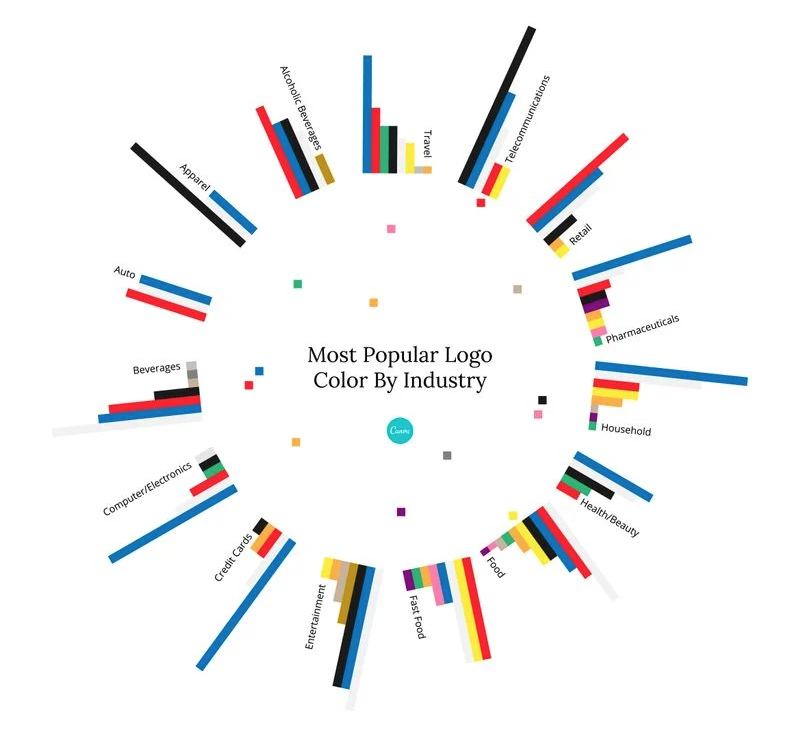
Only use this as a starting point to help guide you.
At Foundr, we suggest beginning with a plain black and white logo and then working with one color at a time to see what works.
If it's not working, you can add color. Some brands even use different versions of logos depending on the occasion. For example, here at Foundr, we play around with the color on our "r":
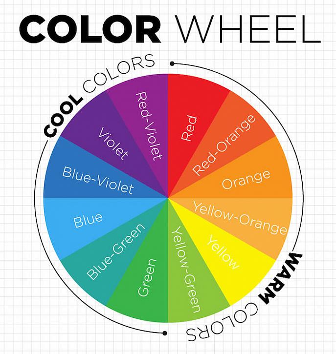
The Color Wheel
If you have one color you like for your logo, play around with a complementary color to really bring it to life. This may be as simple as a black, white, or soft grey as a filler, or something more vibrant.
DecoArt Blog has some great infographics to help with color selection. Let's start with something we may have all seen in school: the color wheel.
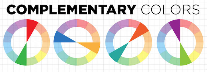
Complementary Colors
Complementary colors are those that enhance (or compliment) each other. See which color lies across from your chosen color on the wheel. Using these color combinations will make the color pop out. Green boosts red, orange boosts blue, even purple and green work in harmony to bring out the best in each other.
Have a look at the old Firefox logo and see complementary colors in action. The orange and the blue clash wonderfully with each other creating a symphony of logo joy:

Analogous Colours
An analogous color scheme involves combining three neighboring colors. The way this works is that you choose your "hero" color, and then include the two neighboring colors on the wheel. Analog color schemes are less invasive than complementary schemes, but they do run the risk of being a little bland.
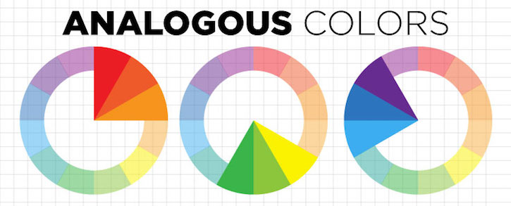
Take a look at the BP logo below. The dominant green color is flanked by another shade of green and yellow.
![]()
Monochromatic Logos
Using different hues of the same color is referred to as being "monochromatic". This is great if you're looking to accentuate the sophistication of your brand. Both Paypal and Oreo rock a monochromatic scheme with its navy blue and sky blue duo.
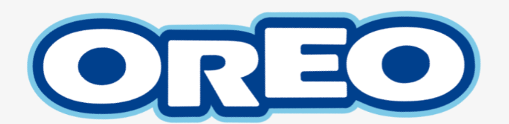
PayPal and Oreo are not in the same industry at all, but both use the same color scheme to great effect. This just proves time and time again that when it comes to logo design, it's more an art form than anything. See what works for you.
Ensuring Your Logo Color and Branding Hues Are Used Consistently
Once you've chosen the logo design that best tells your brand story, the next step is to ensure that your branding is used consistently. Picking the exact shade on a color wheel is next to impossible, but there are a couple ways to ensure that you can pick the right color every time.
Each particular color has its own CMYK code and hex code. CMYK is most often used in print materials, whereas hex codes are most commonly used in web-based design. Whether you design the logo yourself or outsource it to a graphic designer, ensure that you receive the color codes that will help you maintain brand consistency.
What's your favorite company logo? Really proud of your own? Share your favorite use of color in logos below!
Ready to Get the Wheels Turning on Your New Business Venture?
Are you ready to turn your million-dollar idea into a million-dollar reality, but don't know where to start? Check out the Start Your Side Hustle mini-course for free tips that will help you to start generating revenue in no time.

How Many Colors In A Logo
Source: https://foundr.com/articles/building-a-business/best-logo-colors
Posted by: moorenetaid.blogspot.com
0 Response to "How Many Colors In A Logo"
Post a Comment